PrepQuest
Case study of a gamified meal planning app
Role: Researcher, UX Designer, UI Designer
Timeframe: Aug 2023 - Sep 2023 [5 weeks]
Design Tool: Figma

Introduction
This was a project orchestrated by IterateUX as part of the 2023 design challenge I registered for. I was grouped with a team of 2 other designers, and we chose the prompt of designing an app that gamifies healthy recipes and meal planning to support users in maintaining a balanced diet. Since none of us has ever had to design a product in the health and fitness industry (or anything involving gamification), this prompt served as the perfect chance for us to do so.

The Problem
The Solution
In a fast-paced society where schedules run tight and cooking skills vary from individual to individual, maintaining a balanced diet can be a grueling and daunting task to take on.
To create an app that simplifies cooking and meal-planning, making it an engaging experience for users of all skill levels while promoting healthier eating habits.
Design Process
Research + Discovery
Uncover the users’ needs, pain points, and preferences.
Secondary Research
Competitive Analysis
Surveys + Results
User Interviews + Value proposition
Evaluate
Test prototypes, gather feedback, refine app features.
User Testing
Revisions
Define
Clearly state the project’s objective & problem statement.
Value proposition
Interview Insights
User Personas
Journey Mapping
Ideate
Generate creative solutions & create initial app designs.
Sitemap
Sketches
Wireframes
Design System
Wireframes
Phase 1 - Research + Discovery
Secondary Research
To officially kick off the research phase of this project, each of us conducted secondary research to better understand the benefits of the gamification method. From the articles I gathered on the matter, some successful methods for implementing gamification include:
Setting clear goals and milestones in order to keep users moving forward
Visualize progress to reinforce user motivation
Reward positive user behavior (such as completing daily tasks) to keep them coming back
Create a sense of connection and competition to drive interaction between users
Regarding users with badges to create a sense of achievement and motivate them to keep up their health goals
Competitive Analysis
After compiling our secondary research, we each did a competitive analysis of various apps that focused on gamification and healthy meal planning. To see in what ways we could create a quality meal-planning app, we looked into the features, navigation, visuals, and strengths/weaknesses. I was responsible for looking into KitchenPal as the direct competitor and Habitica as the indirect competitor.
Competitive Analysis - Summary
Visuals
Have strong visuals/brand identity with the proper amount of illustrations.
Clean and simple visuals help with user flow.
A bright and colorful theme can keep users engaged.
Gamification
Implement a badge system.
Award prizes to the user for completing health goals.
What to include based on similar features/strengths
Provide personalized diet and meal plan for users based on needs and preferences.
Provide suggestions for the users.
Generate recipes based on what foods users input.
Provide the ability to scan bar-codes.
Input option for nearby grocery location.
Offer calorie + macro tracker.
Grocery list for the week based on the recipes in the meal plan.
What to improve based on weaknesses
Clear fonts with proper labels to improve navigation.
Limit the number of tasks with physical friction in our app.
Improve on usability.
Make sure there are a variety of meal options.
Have a few content at a time. Users can input a few things at a time before moving on to the next page.
Personalization and customization options are key.
Stick to simple and clear navigation patterns.
Figure out a business strategy that doesn’t involve a paywall and involves basic features.
Gaps in the market
Actual day-by-day layout of meals planned for the week.
Meal suggestions based on user preferences, past recipes used, and current fridge/pantry items.
Voice assistant chef- reads out next steps in recipe & can ask it questions about the recipe (e.g. conversions, amount of a certain ingredient, etc).
Suggestions on where to get certain groceries based on current sales and prices.
Surveys + Results
We then came up with questions relating to users’ motivations to eat a healthier diet / how important it is for them (in order to discover any pain points they have with maintaining their lifestyle), and sent the surveys across various online platforms.
From the results we received, we concluded that:
From our results…
We found people were generally motivated to live by a healthy and balanced diet, but found it difficult to be consistent and stay on a meal plan.
Value Proposition
With the secondary research and survey responses as a guide, we then created our questions for user interviews.
From the questions we created, we sought to understand:
Why is it important for people to maintain a healthy diet in the first place
What challenges do they experience when maintaining a healthy diet
What solutions are they looking for with meal-planning and healthy eating
Next was the value prop for features to include based on our survey findings.
Because this was just a 5-week-long challenge, we weren’t able to implement every single one of these. Therefore, the features we did include were the ones that met the most basic needs of our users.
Social support and interactivity with other users.
Little to no friction with creating meal plans.
Gamification that motivates users to stay on track.
Daily/weekly tasks with a reward system.
Meal suggestions based on user needs and dietary restrictions.
A variety of cuisine and recipe options.
Easy-to-make recipes that are beginner-friendly.
Some nice things we thought to include in a possible future iteration would be features like inputting ingredients the user already has for recipe generation, and having a week's worth of recommended meals generated based on the user’s preferences. Eventually, we decided on our value proposition as:
“Unlock a healthier and happier you, one meal at a time.”
This statement highlights how our app focuses on making meal planning and healthy eating easier by limiting the amount of content or friction compared to other apps on the market.
Based on the affinity map, we concluded that our target audience struggles with:
Time + Effort
Making certain recipes, planning out meals, and batch-making meals can be very time-consuming.
Some people’s inconsistent scheduling can make it hard to plan ahead.
Tracking calories can also be too much work.
Healthy foods and ingredients can add up in cost.
Repetitive Dishes
Eating the same thing every day can easily become dull.
Interview Insights
In order to better determine important insights from the interviews and track down pain points when it comes to meal planning, we created an affinity map.
Motivation
People want to be healthy so they can live longer and avoid diseases such as diabetes and liver disease.
Cooking Skills
A large number of people aren’t very skilled in cooking.
Some people simply don’t enjoy the process of cooking.
Phase 2 - Define
User Personas
To officially start the Define phase, we created 2 user personas to help understand our target users’ mindset toward accomplishing their health goals, as well as the challenges they experience with staying on track with their diet. In the end, both personas are also looking for ways to cook simple recipes that fit into their schedules and lifestyles.
In the first persona’s case, she is looking for a better app to help her track calories and create meal plans. She currently uses MyFitnessPal, but it’s not easy to use and requires too many tasks, like scanning calories.
With the second persona, he wants to live a healthy lifestyle, but he works 40 hours a week and has no idea what the best time for him to eat is. He also finds SideChef meals difficult to make.
In summary, both of the user personas created were looking for ways to cook simple recipes that fit into their schedules and lifestyles.
Journey Mapping
Two journey maps were then made in order to identify when each persona experiences frustrations when trying to achieve their eating goals.
User persona 1 dislikes not having adequate time to meal-prep due to her busy schedule, while user persona 2 dislikes the feeling of finding a recipe difficult to follow.
As a result, we decided to implement a schedule plan and a recipe guide to help users meal prep based on their work schedule and break recipes down into smaller steps.
Reframing the problem from the users’ POV
After we narrowed down what our users were looking for when it comes to meal planning, it led us to reframe the problem statement by creating the following user story:
The following “How Might We” statement would also help keep their goals in mind when determining the best features to implement.
“As a busy worker, I want to plan out easy and healthy meals for the week so that I can maintain a healthy diet despite my hectic schedule. I need a solution for easy-to-make recipes and a variety of options to stay on track with my goals without adding extra stress during the day.”
“How might we help busy adults who are motivated to maintain a balanced diet get healthy and personalized diet plans that have easy-to-make recipes, and fit their busy lifestyle so they can still be healthy?”
Phase 3 - Ideate
Sitemap
We then moved on to creating the information architecture to understand what specific features would be designated to which screen.

Through refining with my group and utilizing the research data we collected, we got a firm grasp on the features we would need and what content we wanted for navigation.
Sketches
Using the information architecture, competitive analysis, and our reframed problem statement as a guide, we each made our own Crazy 8 sketches to come up with our own ideas regarding the layout of pages and design elements.


Design System
Using a pre-existing design system was a requirement for this challenge to keep it running smoothly, since we were only given about five weeks. We chose to go with the typography from the ANT design system (which has been updated since the completion of this project), as well as iconography from UIcons.


60
30
10
Using the 60 - 30 - 10 method of color application, we chose orange as the primary, and green as the accent. Both of these colors are associated with health, naturalness, and energy (all of which align with the users’ goals of being motivated to meal prep and live a more health-centered lifestyle).
Palette
HEX: #FFFFFF
RGB: 255,255,255
HSL: 0, 0, 100
HEX: #FF7500
RGB: 255, 117, 0
HSL: 28, 100, 50
HEX: #00B793
RGB: 0, 183, 147
HSL: 168, 100, 36
HEX: #FFCDA3
RGB: 255, 205, 163
HSL: 27, 100, 82
HEX: #A4D1C8
RGB: 164, 209,200
HSL: 168, 33, 73
Text
HEX: #000000
RGB: 0, 0, 0
HSL: 0, 0, 0
HEX: #686E73
RGB: 104, 110, 115
HSL: 207, 5, 43
HEX: #B5B8BA
RGB: 181, 184, 186
HSL: 204, 3, 72
Home Screen

Planner Screen

Meal Plan Edit Screen

Recipe Ingredients

Wireframes
We then transitioned to creating draft wireframes in Figma.
Meal Planner - Empty
Recipe Creation - Complete

Meal Plan Creation

Meal Plan Edit

Recipe Instructions

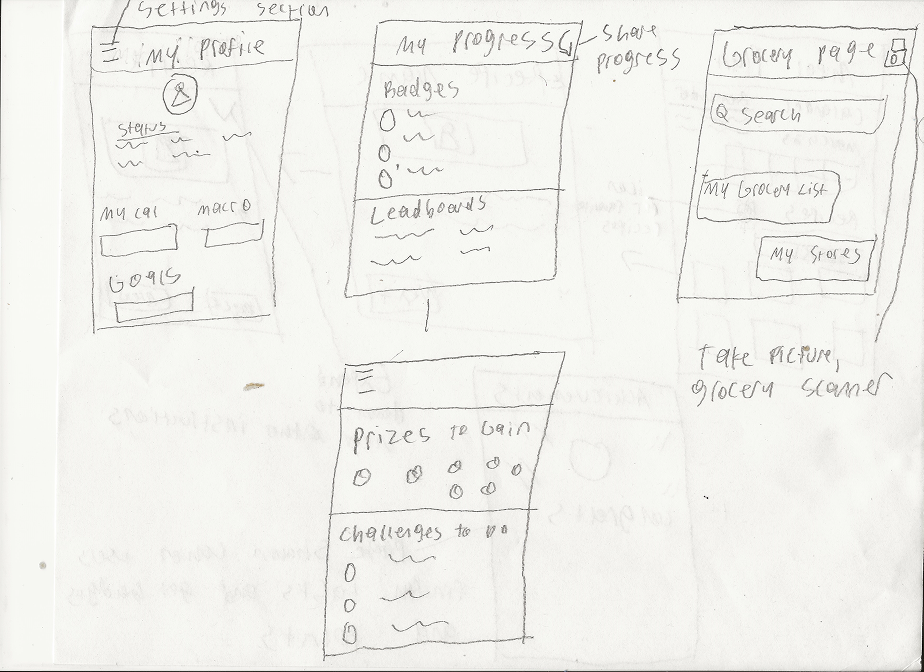
Progress Screen


Groceries Screen

Recipe Screen

Profile Screen

Mockups
With a design system decided upon, we then created our first round of mockups with the following screens:
A Home Screen where the user has access to the total amount of calorie intake needed for the day, their next meal, and quick-time suggestions for recipes.

A Schedule for the user to input their availability so the app can generate the right times to meal prep during the week.

A step-by-step recipe guide for the user to view instructions one at a time for cooking a dish.

A Profile Screen to view the number of macros the user needs to eat, daily goals, and filtering food groups for the app to generate appropriate recipe options, which leads to the Preferences Screens.


A Grocery Screen to see what food items the user has already and what items they need.


An Edit Plan screen to add recipes and filter what they want to eat based on their goals, preferences, and cooking skills (calories and macros included).


A Progress Screen to showcase badges they earned, prizes they can obtain by completing goals and challenges, and leaderboard scores to boost motivation to stay on track.

User Testing
After implementing our design system to our wireframes, the next phase of the challenge was to see how seamless it was for users to create a personalized meal plan and make a recipe while experiencing the gamification of the app to stay motivated
A total of 4 participants were recruited for a moderated testing session. Tasks were given to them while having them think aloud. The results we received were as follows:
“How would you go about creating your first meal plan?”
4/4 had a difficult time finding out how to create a new plan, and took longer than expected.
“Great! Now that you have your meal plan set, let’s check the groceries you’ll have to get. Let’s say you already have ingredients like salt & pepper in your house but need to get other items. What would you do to check off the ingredients you already have?”
3/4 were able to go to the grocery page and check off what items they had.
“Congrats, you just earned a badge! Starting back at the Home screen, how would you access your badges to see achievements you’ve made so far?”
4/4 were able to easily access the badges they earned by going to the Progress Screen.
“Congrats on making your first meal plan! Now, let's say you want to make changes to your meal plan. How would you go about it?”
2/4 had a difficult time finding out how to create a new plan, and took longer than expected.
“Now that we have all our ingredients, the time has come for you to start making a recipe. How would you access the recipe and get the instructions? Please follow through to the end of the recipe for this step.”
3/4 spent a long time finding a recipe they wanted to make.
“Lastly, let’s say you have a soy allergy. How would you set your preferences and filter this food group out?”
4/4 easily filtered out gluten from their diet by going to the profile page and altering the preferences.
After testing, we asked users about their thoughts on the app, tips for improvement, and if they would recommend the product to others.
Overall, they found the app very useful for their needs of meal planning, which was a sign that we were utilizing the research properly to make the best design solutions.
Feedback - Positives
“I like that calories are displayed in order to control my intake. Quick start recipes are great. I get inspiration to understand what to eat now and save time, and it inspires me when I don’t know what to eat.”
“ I like that you view the calendar and plan ahead of the week in terms of meals. Gamification is good and a progress bar.”
“It looks really cool. I like the gamification. It’s very motivating.”
“I would recommend it. Very useful. I personally struggle with planning meals, and I just go with the moment. I always have my phone to help me, and this app would be very helpful.”
“I like the meal plan button, and that I can filter days of the week. I also like that I’m able to edit what meals I want. Love the checklist feature.”
“I love how this splits out meals for you (choosing is the hardest part). It also helps you track your calories by meals (which MyFitnessPal doesn’t do unless it’s a super popular meal many other people use)- the fact that it automatically adds the macros and calories once you complete the recipe is a game changer!”
“The editor page stood out to me because it seems really useful (would like it even more if you could swap out recipes by dragging and dropping), and the “sort by” option is a nice way of categorizing things. The checklist groceries page would also be super helpful when I’m out doing groceries!”
Feedback - Critiques
“When creating a new meal, it took time. I thought I had to go to the profile. When adding meals, I always go to the profile. I feel like everything I should do should be in the profile.”
“Make it easier to use. The challenges on the home page were confusing. Navigation and content on the home screen are confusing, as well as the UX writing/wording.”
“On the next meal you cook, I lost the navigation bar. Some back buttons do not work. Put progress in the profile section.”
“The planner content was confusing. Planners are used to plan. Not to add things like meals. If I add things, I should add them to the profile. The grocery list was confusing.”
“I suggest having something that notifies what ingredients you need to get. I feel like it does not matter if you buy it from a store or online.”
“Creating a new meal plan was tough. I want a button to create the new plan and make the meals. Do it on the home page. Maybe make the progress have different colors to be more motivating.”
“I also think the calendar on the meal plan creator page should actually show the blocked out times and give the user the option to make a meal overlapping some time slots (e.g. if it’s an online webinar or meeting that I don’t have to be on camera for, I could also cook/eat).”
“Lastly, it would also be a good idea to add a “save” button on the Preferences page because there is no visual feedback that what I chose will be saved.”
“The Ingredients page and the Groceries page are too similar, and I got confused when I opened up the Ingredients page. I also think it’s a bit redundant/ unnecessary because at this stage (of opening up the recipe to cook), I should’ve already bought all the ingredients.”
“Also, the meal types to include checkboxes are redundant and can be even more confusing if, let’s say, I only wanted to make breakfast on Tuesday and dinner on Wednesday and Thursday. It would be better if we could pick and choose the type of meal for each day on the calendar instead.”


Revisions based on Feedback
Users suggested integrating their progress into the profile since that is how they would access the achievements they made.
This resulted in getting rid of the progress icon in the navigation bar and implementing all the gamification content within the profile page.
We switched the challenges to daily check-ins to make it clear that the user can access points in the profile to access prizes.


A two-step instructional guide on how to switch certain meals was added as well. The user has to first select the type of meal they want to swap out, and then select the new dish they want.


Checking ingredients has also been removed from the recipe screen to avoid redundancy.
We also added a save button for the Preference screen to showcase feedback that they were able to save the foods they want.
We also added a save button for the Preference screen to showcase feedback that they were able to save the foods they want.
The grocery page now shows a check mark next to each item the user taps to show better feedback.

Conclusion
In conclusion, the crucial moments of learning from this project occurred during the research and UX iteration phases, where I implemented new and impactful methods. Conducting secondary research, employing affinity mapping, and crafting “How Might We” statements became methods that honestly helped me to better understand the mindset of the end-users I was designing the product for. I will now be implementing these design methodologies in future UX projects I partake in.
The advanced prototyping phase in Figma allowed me to hone my skills further, providing a practical application of the theoretical knowledge gained throughout the project. The opportunity to enhance both visual UI and UX design, along with the thorough research and prototyping, has left me feeling well-rounded. I am now equipped and confident to contribute effectively to any UX or UI-based project in the future.
I also felt like I gained a deeper understanding of prototyping in Figma, since there were two separate iterations of the app we had to prototype. The opportunity to enhance both my visual UI and UX design, coupled with thorough research and prototyping, has left me feeling well-rounded. Being a part of this project has left me feeling equipped and confident to contribute effectively to any UX or UI-based project in the future.