Paystride
Case study of a desktop career-transitioning platform
Role: UI Designer
Timeframe: May 2024 - Dec 2024
Design Tool: Figma

Introduction
Paystride is a scan-to-pay platform designed to improve the shopping experience in Nigerian supermarkets. I, as well as a couple of other designers, were brought on to rebuild the Paystride brand and overall user experience.
Problem Statement + Solutions
Key Benefits
Several issues currently reside in the current method of shopping and inventory management.
Inventory Issues: Stores often struggle to keep accurate inventory, leading to problems like stock-outs or excess stock.
Checkout Delays: Long lines at checkout frustrate customers.
Payment Restrictions: Customers want more payment options beyond cash and cards.
Better inventory accuracy through less product loss and better stock availability.
Improved efficiency through faster checkouts frees up staff for other tasks.
Better customer experience through quicker shopping.
Stores get useful data to improve operations.
Step 1
Step 2
Step 3
Research Phase
Ideation Phase
Visual Design
Strengths
Opportunities
Secondary Research
The research phase was officially commenced by gathering information on competitor scan-to-pay apps. Along with comparing different scan-to-pay applications, I also found these articles that covered what makes a good scan-to-pay app.
Convenience-focused solutions like scan-and-go technology can be a way for smaller retailers to stand out against larger competitors.
Shopreme and Instacart’s technology are designed to mitigate the potential for shrinkage by analyzing shopping patterns to identify people whose activity warrants stopping them for an audit based on factors such as how they are shopping, their scanning speed, and whether they are familiar to the retailer.
Shopreme’s scan-and-go technology pays attention to factors such as whether a shopper has used scan-and-go at a given retailer in the past, their shopping history, and the items they are purchasing, to keep spot checks to a minimum to avoid unnecessarily inconveniencing consumers.
Scan-and-go technology can be a stepping stone to frictionless checkout solutions that use artificial intelligence-driven cameras to automatically identify and record items as people remove them from store shelves.
Scanning accuracy without compromising swiftness.
Introduce a loyalty program that rewards users for consistent and accurate use of Paystride.
Offer discounts, cash back, or special promotions.
A thorough mini-tutorial of how Paystride works for beginners to minimize any customer errors.
Innovative security features that reduce the need for manual checks (biometric verification or fraud detection).
Offer personalized product recommendations based on the user's shopping history.
Incorporate personalized promotions or notifications for users when they enter the store to create a more engaging shopping experience.
Weaknesses
Scan-and-go carries the inherent risk that shoppers might inadvertently or willfully neglect to scan items.
While checking selected customers’ orders might help keep people from walking out with items they haven’t paid for, making shoppers scan their items a second time can be seen by shoppers as intrusive.
Scan-and-go “takes away a little bit of the customer experience you’re trying to provide”.
“It’s taking time or saying, ‘I don’t trust you,’ and neither one of those is the message you necessarily want to send out if you’re using this product.”
Threats
Obvious threat of security and fraud risks for retailers.
If the anti-fraud features aren’t well-developed, individuals could easily exploit them.
The possibility of customers perceiving the scan-to-pay system as intrusive or implying distrust.
Rapid adoption of similar technologies by other retailers.
Stores may be hesitant to adapt scan-to-pay technology due to concerns about job security or additional workload in managing spot checks and customer interactions.
“5.1 Principles of a good user interface design”
“How Scan & Go improves store efficiency”
I also came across an article discussing effective strategies for implementing scan-and-pay technology, making note of the most important takeaways.
“What constitutes a good user interface design are clarity and simplicity. That means giving clear instructions to the users, so they know without a doubt how to achieve their goal.”
“Simplicity, in this case, suggests an interface without clutter and distractions, which would derail users from what it is they are trying to do.”
“Embodying these principles in a holistic approach is what modern Scan & Go technologies today are all about. Providing users with a frictionless experience – from scanning all the way to the end of the payment process – and making this journey as intuitive as possible within one full mobile solution, must be the goal of any successful service.”
“Thinking ahead, new possibilities are already on the horizon, with features like suggestive scanner animations clearly showing the next steps within a great user experience.”
Researchers at the University of St. Gallen found that customers using Scan & Go had spent 10% more money per shopping trip, compared to customers using the cash desk.
This effect can be explained by several reasons:
Integrated customer loyalty systems encourage customers to buy more products.
Recommendations help customers identify products they like.
Items that have been scanned but not yet purchased are less likely to be removed from the basket.
Thus, reducing the checkout time has a positive effect on the customer as well as the retailer.
“Making the Scan & Go solution your own”
“Even though a ready-made platform can be an affordable and convenient solution for some, from a strategic point of view it makes sense to take advantage of the many benefits which an individual software offers, such as:”
“Better customer loyalty, through direct communication.”
“Branding opportunities, through customizable design.”
“Flawless integration into existing tools.”
Walmart+
Strengths
Opportunities
As far as gathering information on competitors, I found an article reviewing Walmart’s mobile scan-to-pay application, Walmart+, and did a quick SWOT analysis.
Lets you shop and check out independently and contact-free.
Barcode scanner is quick and accurate.
The step-by-step process from adding an item to final checkout is organized and well-designed.
Digital receipt only.
Integrate a way to support weighing produce within the app itself.
Also implement an easier way to purchase alcohol.
Automatic barcode scanning.
Digital receipts as well as access to past purchases in the app.
Weaknesses
You must buy weighed produce and alcohol separately.
App may glitch.
Stopping to scan each item can feel clunky if you're a new user.
Threats
Walmart+ is an app that already belongs to a well-established brand.
Item Scanner

PWA Mockups
After research, I got started building mockups for the PWA (Progressive Web Application), where users could access and use the app through their browser and install it on their device to provide the experience of a standalone app. Creating the flow of a user making a purchase through the PWA took the least amount of time to complete since the objective of scanning an item and making a purchase was fairly simple. A majority of the focus and effort went towards rebuilding the desktop version of Paystride.
From the PWA item scanner, the shopper simply places the item’s barcode in the middle of the scanner.
Payment
The shopper then selects their preferred payment method and pays the total amount.


From the payment screen, the shopper can add a new card.

Shoppers can also transfer funds between accounts.
Paying via cash is also an option, since apparently in Nigeria it’s still the preferred method.

Add to Cart
After scanning the item, the shopper can then select how much of the item they want to add to the cart.

Confirmation
Once the shopper pays for their items, a QR exit pass is generated for security to scan. An e-receipt is also attached for viewing.


Dashboard Redesign
Desktop
After completing the design for the PWA, I was then tasked with revamping the existing desktop version developed specifically for merchants and store owners to manage their inventory effectively.
Initially, when I was doing the redesigns, this is how I modeled the dashboard, where the store owner would be greeted with all of their business's happenings.

Eventually, two new designers were brought on to assist with re-creating the desktop UI. Together with their input and perspectives, we were able to come to this new layout for the dashboard.


The view for recent transactions was shifted more into helping to quickly identify issues that need attention and confirm everything is running smoothly.
The navigation bar was redone to include a search bar to conveniently locate products, as well as an option for the user to log out.
Transactions

I figured it’d be important to showcase the tasks the store owner has to tend to, as well as having the option to view each specific item for each task.

Seeing as though viewing the number of paypoints was already available on the top section of the dashboard, I thought to replace it with a more in-depth card of the top-selling items.
Sales and Settlements are key metrics on the dashboard and need more prominence. The previous design needed more space to provide information that delivers clearer insights to the user. To compensate for this, we repositioned this section to make it stand out and provide more impactful details.

Include a headline like 'Dashboard' or 'Transactions,' along with a brief description to help users understand what to expect from each screen and enhance the overall user experience.

On the separate in-depth page for top-selling products, store owners can view stock availability as well as a performance overview for said product.
The chart for sales was scaled down to not take up so much screen space.

Showing performance trends for the products would help users see whether a product is selling better or worse compared to before. Also, we decided to add images to the product descriptions to make the information easier to digest at a glance.
Following the example of how the dashboard was re-designed, me and the other designer on the team applied the same new layout for the rest of the pages of the desktop app.

The page for tracking customer transactions now includes notifications for the performance of total transactions, as well as any issues with payment, which is why we also included payment method and payment status information.
Payment Point


Store owners can choose to display the info on each employee’s payment point by the day, week, month, as well as the year.
Settlements

Aside from following the new visual layout, a major change for the Settlements page is being able to authorize payouts.
Inventory Page
The whole process of adding an item to the inventory has undergone key changes.
Initially, for adding an item to the inventory, the user would be taken to a form to fill out after selecting “Add New” and choosing a category under “New Composite Item”.

For the redesign, the option to add an item to the inventory was relocated as an option under the tab. Options for viewing the inventory and drafts were also created.

The process of creating an item for the inventory has been streamlined to include only the most necessary information, divided into separate pages to ensure the user doesn’t have to continually scroll.

As a result, when the user clicks on the “Add new Item” option on the sidebar, they’ll instead be taken to the newly designed page where the options to add items in bulk and add a new item have also been relocated.
In order not to have users scroll continuously to complete a form, all the information to fill out is now presented in sections.

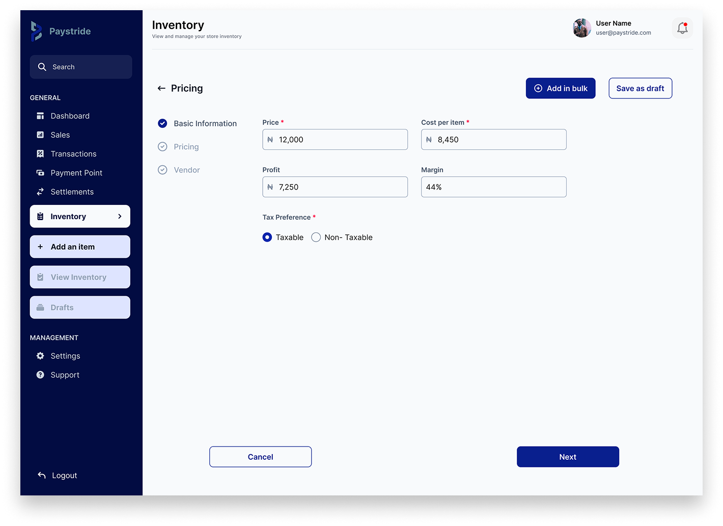


After filling out the required information, the new product is added to the inventory.
Adding Bulk Items
The process for storeowners to upload bulk products to the inventory has remained the same across the two versions of the desktop app.
The user starts on the page to add a new inventory item, then selects “Add in bulk”.

A modal will then guide the user through the steps of uploading the template to the system.

Saving Drafts
All saved drafts will now appear in the dedicated sub-section of the Inventory menu, where users can continue to edit or delete each item.

General Settings
Settings + Support
Lastly, me and the other UI designer redid the designs and flow for the settings and support sections.


The most notable change with redesigning the general information section of the settings page is moving the tabs to the top rather than having them on the left-hand side. This is a change recommended by my design partner. After clicking the Settings button, users would expect the content to be centrally aligned, especially on a desktop view. This was done to help maintain seamless eye focus when switching between views in the Settings page.


Another suggestion for the entirety of the desktop app in general was to feature a headline for each page, along with a brief description to help users better understand the purpose of each part of the site.

Staff
Since many companies or merchants may have multiple employees accessing the dashboard, it would be optimal to display which user is currently logged in.

Permissions

For some reason, the names of the employees under each role isn’t present in this version.
Creating New Password/Password Reset


The previous design had omitted some fields that would be necessary for adding new staff. Me and my design partner included important information such as which department the employee belongs to, the staff number, and access rights.
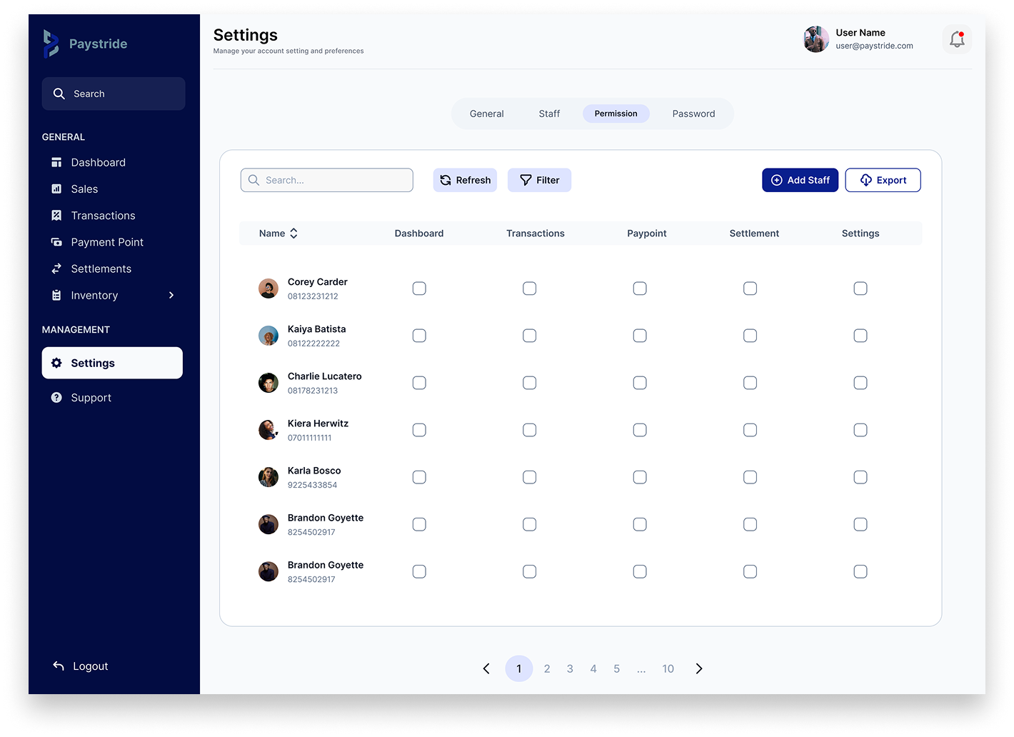
Including employee profile pictures will help storeowners more quickly and accurately identify which individuals they are granting access to.
The initial design didn’t feature any security measures in order for the user to change their password.


A confirmation code step has been added to the password creation process to enhance security.

Support


Conclusion
While the workload was certainly challenging at times, I was able to navigate through it and continue making progress. Initially, much of the design work fell onto me due to limited contributions from the original team members, who eventually stepped away from the project. Fortunately, two additional designers later joined the team, and their support was invaluable.
Their new perspectives and input introduced features and improvements to the original design I hadn't previously considered. These changes significantly enhance the outcome of the desktop version of the app. Their involvement reinforced just how crucial effective collaboration and a well-matched team can be.
This experience highlighted the value of staying open to others' ideas and being adaptable in a team setting. Thoughtful collaboration not only lightens the workload but can also lead to results that exceed your original vision.