CareerFit
Case study of a desktop career-transitioning platform
Role: UI Designer
Timeframe: Sep 2022 - Mar 2023
Design Tool: Figma

Introduction
The concept of job security has lost all meaning. Whether you work in a Fortune 500 company or a startup, layoffs can happen anytime. The evidence is presented by the devastating layoff period towards the end of 2022 through early 2023, with over 500,000 employees laid off from tech companies like Google, Amazon, and Meta. People are now starting to realize they need to improve and strengthen their existing skills since there’s also demand for jobs in the tech field. While plenty of resources exist for people to improve their skills and even transition to another industry of choice, the endless resources available can make it overwhelming for people to explore efficiently. My team and I came together to create a space where people can explore and learn effectively without being confused and plan their career paths accordingly.
Step 1
Step 2
Step 3
Research Phase
Ideation Phase
Visual Design
Research Phase
After coming together to decide on what we were designing and who we were creating the product for, we officially got the project started with the UX Research phase. The aim of the research was for us to understand the effectiveness of different online platforms in overcoming difficulties associated with career transitions. We also wanted to find the helpfulness of these platforms in providing necessary information, guidance, and support, and examine both positive and negative experiences individuals have had using these platforms.
We set out to investigate the importance of networking during career transitions and the role that online platforms can play in facilitating networking opportunities. We did have preliminary assumptions about our users so as to validate them during our upcoming research:
Users looking to change careers as they identify the skills that are missing to make the switch.
The majority of users who tried to change careers are successful in doing so.
Users were between the ages of 21-30 when they decided to change careers.
Users searched on platforms such as Udemy and Coursera to start learning new skills.
Users connect with people on LinkedIn who are in the industry to learn more about the role.
The number of resources available could cause a scenario where there are too many options to decide which ones suit their specific needs.
While we were waiting for responses to the screener survey to schedule interviews, we were trying to identify existing products in the market that solve our preliminary assumptions. We identified several competitors, and hence, we did a quick SWOT analysis on the top four companies tackling the assumptions.
SWOT Analysis
We chose to do a SWOT analysis to understand what is lacking on platforms such as ADPList, Muto, and Pivot, that could be implemented in our solution. After our analysis, we scheduled interviews with 6 different people from our screener survey. The results ranged from people working in various industries, and age groups ranging from 21 all the way to 50+. This was key for us to understand at what ages people decided to make a change. What we found was quite interesting and did validate some of our initial assumptions.
Our survey revealed that the majority of our example user group falls between the ages of 22 and 40.
We found that our users consist of recent graduates who are just starting or looking to transition into a tech job that is different from their main studies, as well as seasoned professionals who want to switch to the tech industry from a different discipline.
People usually just looked up resources online and, at times, have been overwhelmed, confused, and unsure of how to proceed.
They all mentioned that a structured plan to transition would be easier than being left to search without any guidance.
Surprisingly, we discovered that almost none of our respondents have used a paid career consulting product before, since they can be expensive. The most commonly used products that our users have turned to for help with their career journey are LinkedIn, Facebook groups, Reddit, and Slack. This finding is particularly interesting because only LinkedIn is officially dedicated to careers.
Most of them prefer to use learning platforms on browsers rather than mobile apps, but would be open to using social apps on mobile devices.
From our findings, we then identified the pain points and needs of our user audience. The main needs of our users were the ability to talk with mentors and communicate with others, as well as being able to identify the realistic expectations of the career transition process. Overall, our findings cemented our assumptions, which then helped us move forward to the next phase of trying to identify solutions on how to tackle these issues.
Ideation Phase
We then started to think about how we could provide a structured learning space for people to benefit from, and at the same time, provide a way for them to connect with other individuals and gain mentorship. There were plenty of ideas on the table in terms of what to include in our product. Therefore, prioritizing them all was of the utmost importance.
Some of these ideas included:
Sharing personal stories to keep the authenticity and real challenges faced during the transition.
Providing the user with realistic job expectations and requirements.
Providing the user with a step-by-step plan to reach the required skill set.
Providing the user with valuable courses from different resources and explaining how it's going to help them.
These were just some of the initial ideas. In the end, we finalized a few of them for the MVP of the product and moved some of them to the next steps. These include:
Providing the ability to identify and learn the different terminology of the field that they are transitioning into.
Providing different resources such as courses, books, podcasts, articles, etc, that help them with their career transition.
Offering mentor capabilities free of cost. (Similar to ADPlist)
Introducing communities where people can join to meet other people going through the same transition as them and learn from each other.
Implementing a task tracking feature to track their progress with everything to do with the career transition, such as course tasks, books, articles read, etc.
Having finalized the ideas for our product, we then moved to work on the information hierarchy. We wanted to minimize the number of interactions needed to achieve the target goal. We came up with multiple information hierarchy models, but we ended up going with the following.
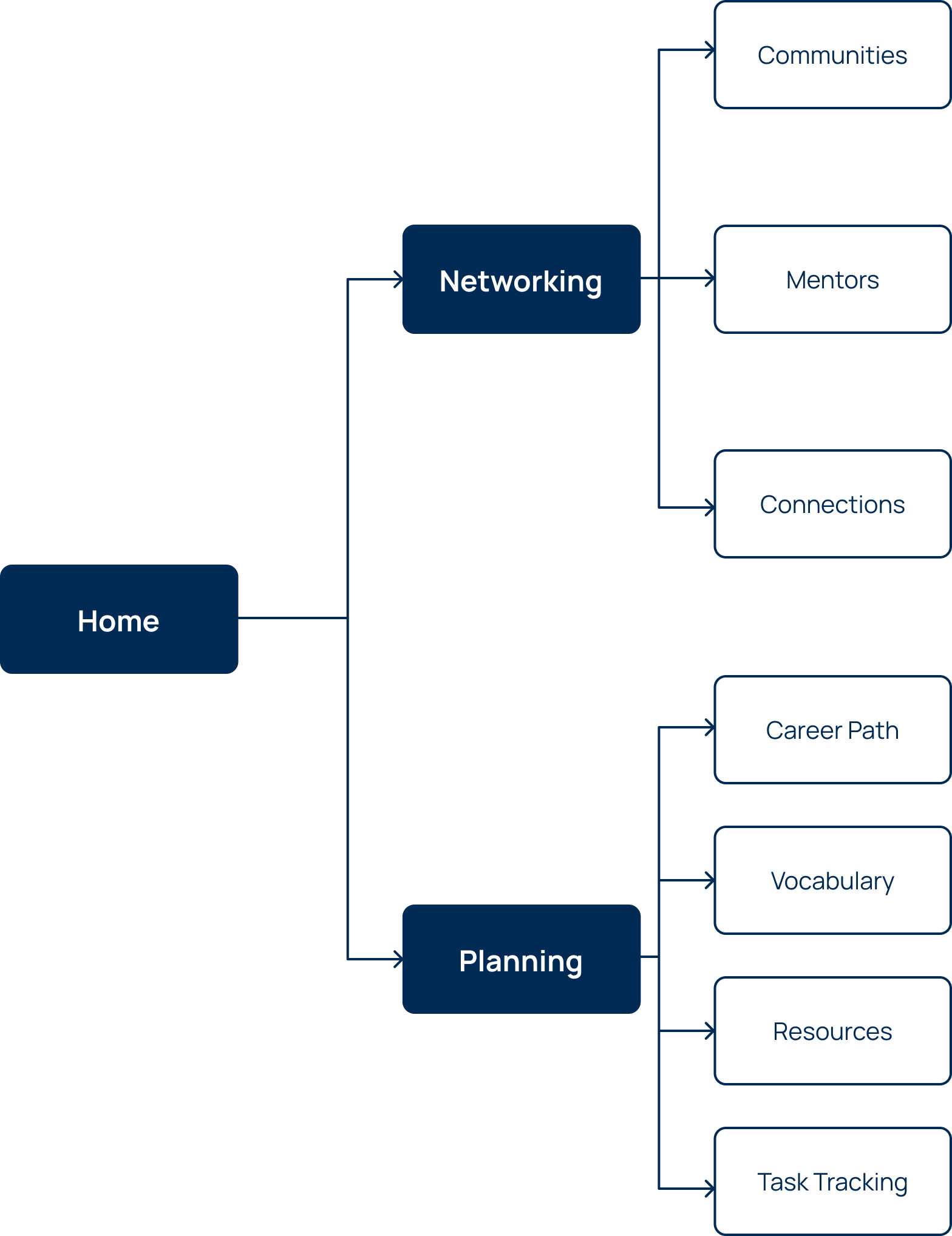
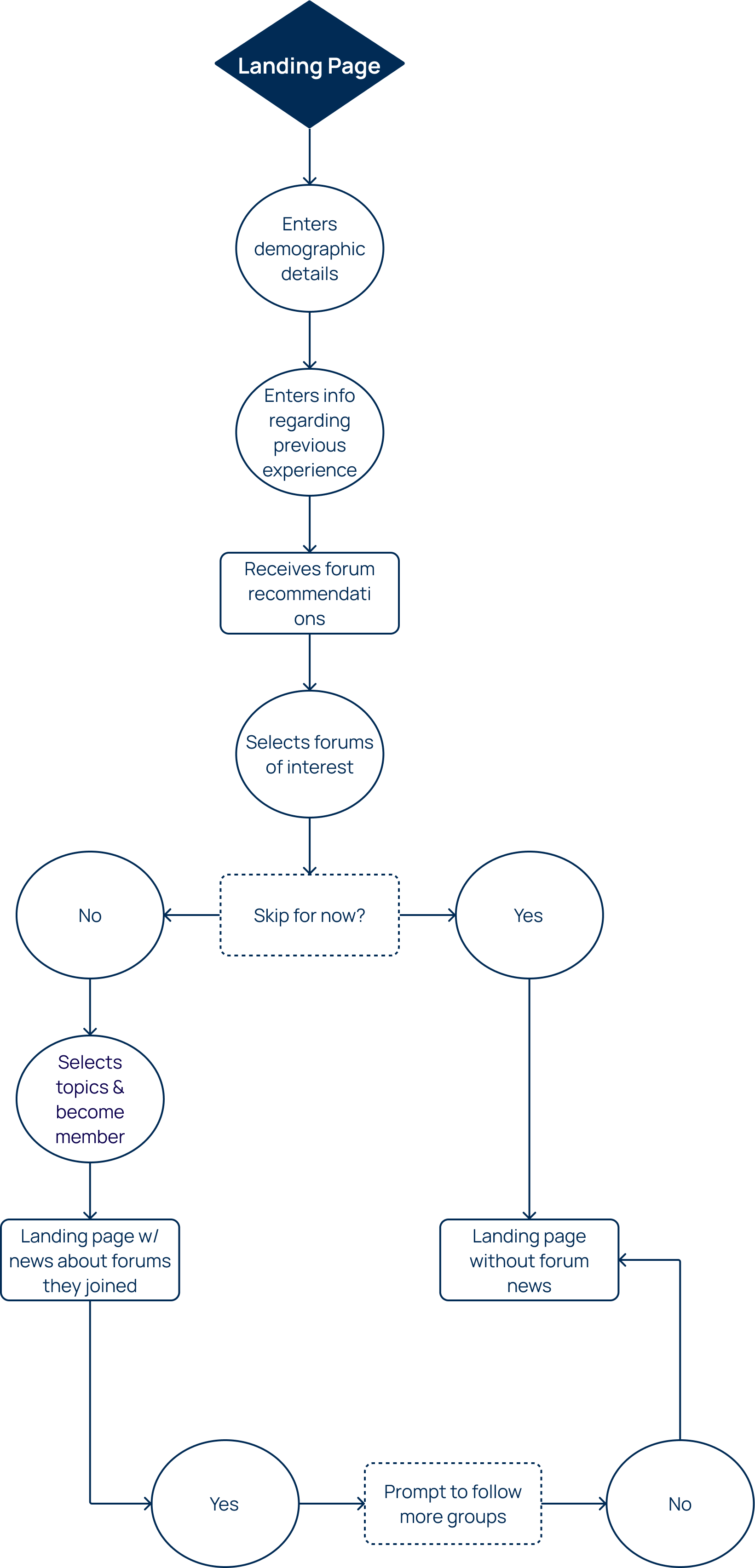
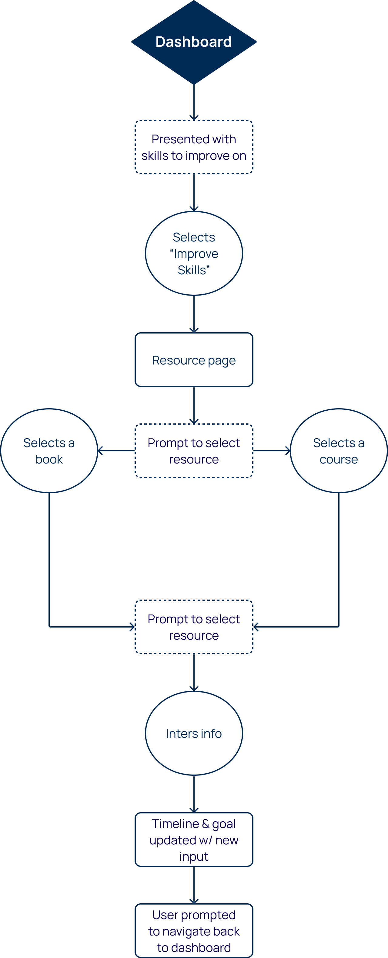
This structure covers the key pain points that were faced by our user research and focuses on addressing them in a functional way. As we finished the information hierarchy, we then worked on the user flow,
basing it on key scenarios of the product that would help us understand the steps for each of the individual phases in the hierarchy.
User Testing
Once we completed the hierarchy structure and the user flows, we then moved on to creating the interactive prototypes.
Afterward, we then moved on to recruiting some users for our next phase to ensure we were on the right path. We conducted a moderated user testing session with two users to try and help us improve our product. The questions for preliminary user testing were as follows:
Complete the onboarding to our new app by signing up.
Follow the tutorial on how to set up your first task.
Once you finish, try to complete the third step, “Ask for advice”.
Finally, try to find a new course to start to improve your career.
We received some rather insightful responses from the user testing, with the key results being:
Our USP, which was the step-by-step career path was completely missed out by the users.
The task tracking seemed to be too tedious and unnecessary.
Mentorship was very much appreciated, but the ‘Ask for advice’ button seemed daunting,, and they felt comfortable talking to other users within the community before going to mentors.
The resource section was a bit too overwhelming as well, since all the available resources (Books, podcasts, articles, podcasts, etc) were merged together.
Visual Design Phase
We then iterated on our product and adjusted the features. We removed the task tracking feature completely and the ‘Ask for Advice’ Button. We also broke the resource section into its subpages, with each page focusing on a particular resource, making it easy in terms of development and not having multiple filters as well.
With these iterations in mind, we improved our wireframes and jumped right into the UI designs. We defined our branding identity and aimed for a casual, yet professional look by experimenting with color combinations and drawing references from similar products on the market.
Final Product
Conclusion
This was certainly an interesting and informative experience for me from start to finish. Since it was my second collaborative design effort, I didn’t know what to expect going in, which caused some anxiety. However, I still wanted the chance to improve my design skills and participate in another collaborative venture since it’s what I’ll be doing more of in the near future. There were definitely many challenges our group faced. Mainly, the group started out with 7 people, but dwindled down to just 4 after a while. There was also a lack of clear communication among the group back when there were still all 7 of us. Regardless, we carried on and saw this project through to the end with just the 4 of us.
I definitely took away quite a lot from this project, and ended up contributing in ways I certainly didn’t anticipate. I ended up contributing to the group in virtually every phase of the project, not just UI, like I was originally designated. As a result, I would say this experience helped me become a more well-rounded designer. I was also able to shadow user interviews and eventually conduct one for the final user testing phase. Doing this also allowed me to become more comfortable with conducting interviews for projects.
Probably the biggest takeaway for me was learning to become more comfortable with group collaboration since communication is a key aspect of the design process as a whole. I also learned the ins and outs of Figma during my time on this project. Prior to this, Adobe XD was still my design tool of choice. Now I can certainly say that I prefer working with Figma. It serves as a great tool for cross-collaboration, and seeing as it’s an industry-standard tool, it’s great that I now have as much knowledge of it as I do.
Gaining new design and industry insight from my other group mates is also a nice takeaway for my future endeavors. Since my other group mates were more experienced than I was, I did feel some pressure to prove my abilities and worth as a designer, and to make sure what I brought to the table was reflective of all the effort I had put in. Regardless, I’m glad I stuck around to the very end to see the amazing product we created, as well as to get the opportunity to further my skill set in both UX and UI design.