Re:Live
Case study of a responsive news outlet web app
Role: UI Designer
Timeframe: Mar 2022 [3 weeks]
Design Tool: Figma

Introduction
This project was hosted by CareerFoundry and intended for recent alumni to receive experience collaborating with other designers. The brief called for us to create an onboarding flow for Relive news outlet that allows users to register for and differentiate between the exclusive subscriber emails, marketing emails, and newsletters they offer.
Since Relive has been encountering problems with exactly how users ought to sign up for their services, it was up to us to demonstrate both our skills to figure out how to go about solving this issue.
Our challenge for this project was to create a set of screens that would help potential users differentiate between opting in for emails and newsletters, and increase the company’s paid subscriber count.
Initial Steps
The first step in creating an onboarding flow was a session in which both of us brainstormed ideas and conducted research analysis on competitive sites. Each of us was responsible for analyzing the onboarding steps of select outlets and documenting how they signed users up and accessed various features.
User Flow - The New York Times

User Flow - BBC


User Flow - Reuters
A synthesis chart was then put together based on our findings that compared each site’s strengths alongside its weaknesses.
Wireframe Sketches
Based on the research gathered, the next step was for us to develop rough layout sketches of how Relive’s onboarding process should flow.


Landing Page

Newsletter Info

Credit Card Details

Low-Fidelity Wireframes
Modal

Subscription Info

Subscription Confirmed

Email Info

Payment Info

Newsletter/Marketing

After brainstorming for ideas, researching other online news outlets, and sketching layout ideas, the UX Designer then proceeded to create the first set of low-fidelity prototypes for Relive’s onboarding process.
Mid-Fidelity Wireframes
Afterwards, the grayscale mid-fidelity wireframes of the onboarding process were created.

Typography

Color Palette
HEX: #362E2E
R: 54
G: 64
B: 64
Afterward, the grayscale wireframes were then handed off to me to finalize the UI and visual design while following the styling guide provided.
HEX: #FFCC1A
R: 255
G: 204
B: 26
UI Design
Buttons + Tags

HEX: #FF4242
R: 255
G: 66
B: 66
Logos

HEX: #FFFBED
R: 255
G: 251
B: 237


User Testing
With the mid-fidelity wireframes complete, the next step in the process was testing the product with select users via interactive prototype using the following scenarios:
“You are visiting the Relive website for the first time and want to learn about what benefits the site offers its users other than news.”
Direct Task: Look up the types of email signups for the users and the benefits of each.“You are a sports enthusiast, but do not have the time to read every sports article and want to receive a weekly summary in your inbox. How can you accomplish that?”
Direct Task: Sign up to receive the Sports newsletter.“As a student, you are living on a tight budget and want to find the best deals on your upcoming trip and shopping. How can you receive the deals in your inbox?”
Direct Task: Sign up to receive deals and discounts.
4 users were then interviewed (2 for each participant).
The UX designer tested synchronously via video call, while the other pair was asynchronous.
P1
P2
P3
P4
Gender: Male
Age Range: 40+
Role: Professional
Gender: Female
Age Range: 14 - 18
Role: Student
Gender: Female
Age Range: 20 - 25
Role: Insurance
Gender: Male
Age Range: 40+
Role: Professional
Feedback + Final Design
Once the user testing was conducted, the results were synthesized via Rainbow Spreadsheet and the Jacob Nielsen rating scale. The final changes were then applied to the design based on the feedback received.

Based on the feedback, once the modal on the home page was closed, there was no other way to view the types of services being offered. A header with a CTA button to learn more about Relive's subscriptions was also added to remedy this. That way, if the modal were to be closed, users would still have a way to learn more about Relive's subscription services.

Another issue one of the users had was not knowing they could choose to subscribe to any one of the types of emails. Text was then added to the top of the page to explain the context.
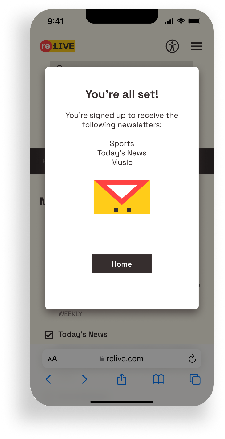
Along with the first confirmation message informing users they have successfully subscribed, another message was created to let users know which newsletter topics they signed up to receive.
Desktop Layouts
Lastly, I went back and re-created a select few of the screens for desktop breakpoints. Even though the project was officially complete by this point, I felt it was still important for me as a UI designer to showcase how a product would look on another platform.


Conclusion
Overall, I believe this project was a success in terms of designing an onboarding flow that enables users to sign up for and subscribe to marketing emails, exclusive emails, and newsletters.
The main obstacle during the couple of weeks of completing this project was that my partner and I were rather new to collaborative design work. Work-life balance was also a factor in why we couldn’t initially create desktop breakpoints to accompany the mobile designs during the project. However, I did manage to take some time to finally create the desktop screens after the end of the project, as I felt it was necessary to further develop my skills in designing for various breakpoints.
As the weeks progressed, we both became more comfortable with partner coordination and checking up on progress frequently. We also felt as if we had become better at file management and keeping track of what tasks we were each responsible for by the end.
Participating in this collaborative design project was great for the first exposure, and with issues of scheduling and availability aside, we both plan to take everything we’ve learned from this experience into future collaborations and projects.